

Timeline
Role
In a live-streaming context, the UX for non-Korean-speaking K-pop fans has room for improvement. The language barrier poses a challenge for viewers who want to become fully immersed in the content alongside fellow fans. Since live-subtitling technology is currently not advanced enough to be leveraged, I needed to design a feature that would improve the experience for K-pop fans all over the world by making livestreams more inclusive and easier to understand.
I guided the thorough quantitative analysis on data gathered from a prior study, and led the design direction of potential solutions that could be fleshed out with the end goal of creating a functioning high-fidelity prototype.
I presented the final prototype and a review of the design process utilized to my project coordinator and other members of faculty, who regarded it as a successful and innovative advancement in overcoming language barriers in the digital space.
1
Data Review
2
Data Analysis
Given the large amount of data at my disposal, I made use of the Affinity Mapping process to help make sense of the qualitative information collected from interviews in a way that was easy to both group and visualize (Figure 1.0).
3
Identifying Pain Points
Once patterns and trends in the data were observed, they were studied alongside supporting online survey responses, allowing us to identify two key pain points faced by existing users: a weak understanding of livestream content, and a strong desire to engage and connect with the wider community (Figure 1.1).

1.0
Snapshot of Affinity Map groupings.

1.1
Intersection of groupings that defined the problem space.

1
Ideating
With the brainstorming complete, I dove into creating low-fidelity sketches to help articulate my initial ideas (Figure 2.0).
After a series of discussions with collaborators, we decided to move forward with the live chat summary feature: a module that would summarize the content of the live chat and display it to users via an AI generated text summary.
2
Prototype - Iteration 1
Implementing a content hierarchy based on user-demonstrated value allowed me to give precedence to the generated text summary over any additional content that could be displayed in the module.
Additionally, an expand/collapse interaction was designed at this point, with the idea that users could display or hide additional secondary content based on their preferences.

2.0
Low fidelity sketches.

2.1
Prototype Iteration 1.
3
Secondary Content
I leaned on research from the prior study as well as the data analyzed as part of this project when selecting the most valuable and feasible content additions:
The data highlighted a strong inclination among users to connect with other fans during a live, and preliminary research showcased the potential of existing deep learning models to accurately analyze emotions from text.
Preliminary research outlined fans' tendencies to comment the flag of the country they were viewing from, indicating the potential to foster a more inclusive environment with a connected sense of identity.
4
Prototype - Iteration 2
For my second iteration, I focused on using delightful design principles for the visual representations of secondary content, and tested with a multitude of languages:
Emojis were used to represent the emotions and countries in chat; it was important to use a design language that came across as friendly and playful to make the data both relatable and easy to interpret (Figure 2.2).
Once the primary and secondary content was finalized, I mocked up the UI module in different languages to ensure the design was scalable and remained visually consistent (Figure 2.3).

2.2
Snapshot of Affinity Map groupings.

2.3
Mockup in Korean to test visual consistency.

1
The "Informal" Usability Study
While the timeline of this project couldn't fit a full-fledged usability study, I felt it was important to get more eyes on the latest iteration of the prototype.
As a result, the designs were shared with a few colleagues, friends, and wider project contributors in order to gather some quick (but valuable) feedback:
Colleagues and friends stated that closing the actual live chat while leaving the live chat summary open would be their preferred way of engaging with streams - a testament to the feature's ability to make the live chat experience less overwhelming!
My project coordinator highlighted the potential to motivate viewers to populate the live chat with relevant text that could be used to help generate an accurate summary.
2
Finishing Touches
Based on feedback from my project coordinator, I made some additions to the prototype before handing over the final pixel-perfect prototype (Figure 3.0):
An introductory state was added to help generate a more accurate text summary while simultaneously increasing user engagement within the live-stream.
The expand/collapse functionality was removed from the new state to direct user focus towards the live chat summary at the beginning of the livestream.

3.0
Introductory state with mockups in different languages.


There was a lot learned over the course of this project, with these being some of my key takeaways:
Data + Insights = Empathy
Using data to learn about the user's needs and pain points allowed for a nuanced understanding of the user experience.
Design for diversity
While navigating linguistic and cultural barriers is complex, there is value in solutions that are both accessible and inclusive.
Balance rigor with practicality
Adapting research methods and design processes in response to constraints ensures holistic project progression.
That's a wrap! Check out the final MVP prototype (Figure 5.0) and a context mockup (Figure 5.1) of the live chat summary feature below.
Heads up! There's a lot of extra detail in this project that wasn't covered as part of this breakdown - if you'd like to learn more about the end-to-end process, let's chat!
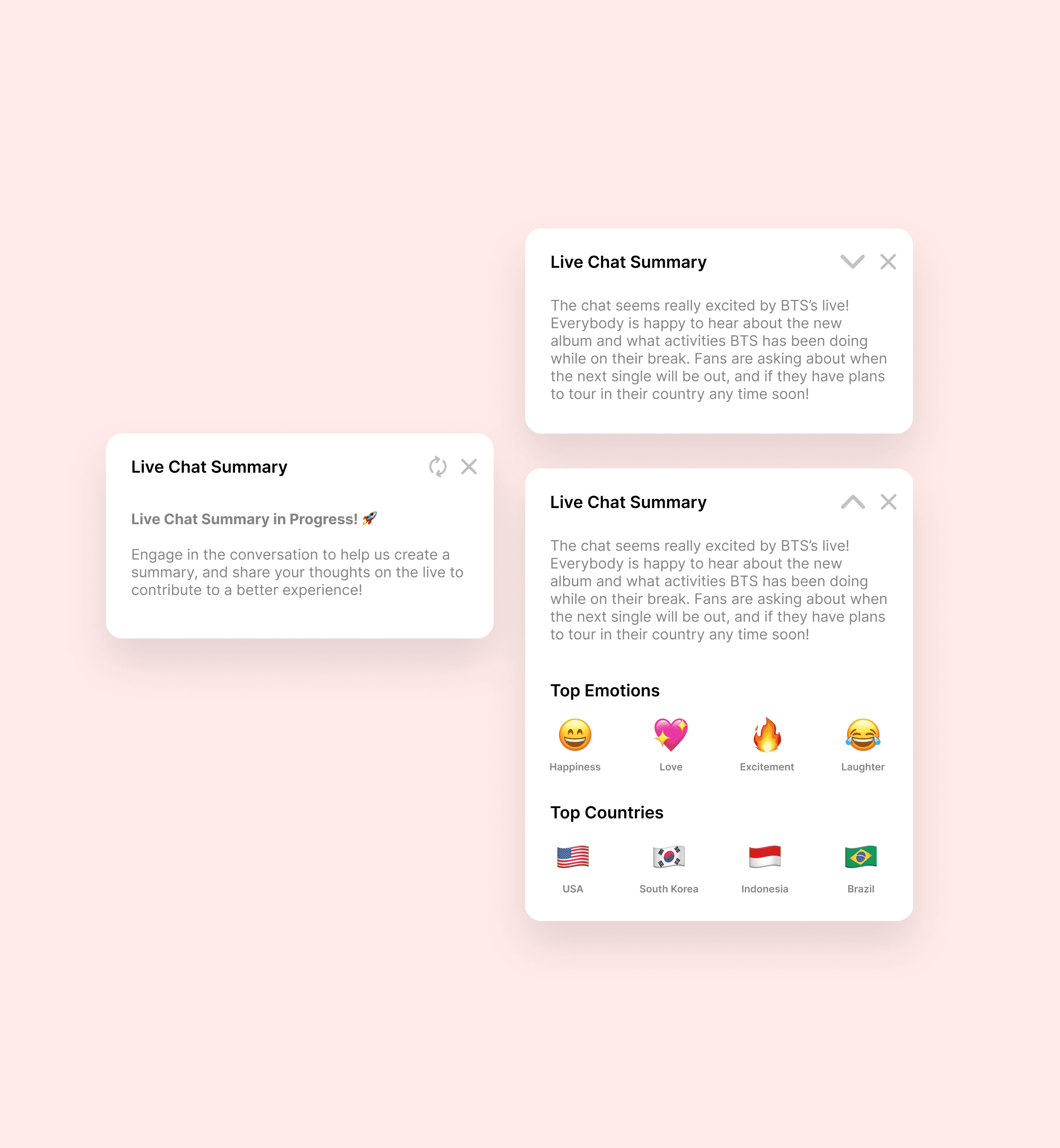
5.0
Final designs for all three states of the Live Chat Summary module.
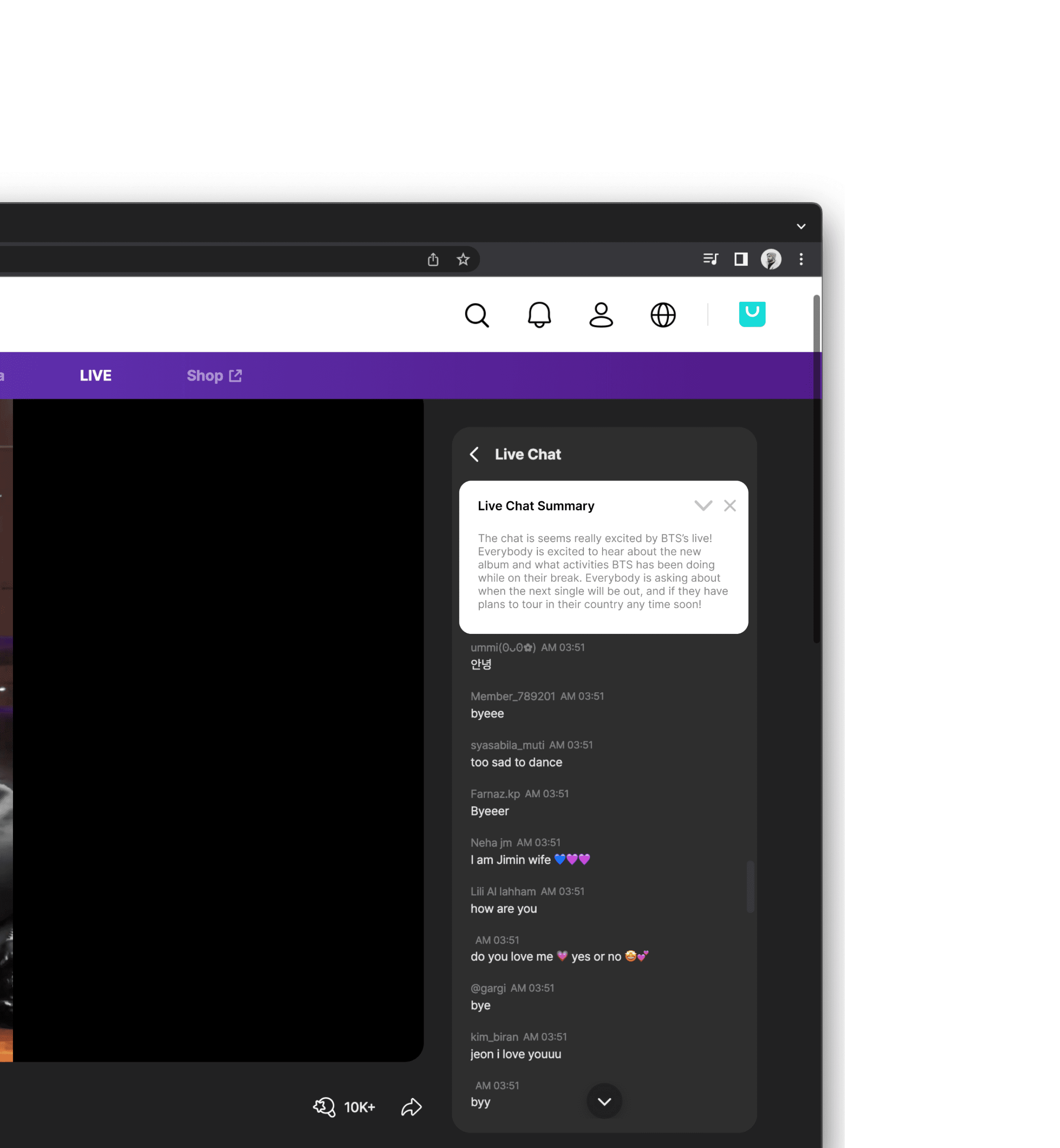
5.1
Context mockup of the Live Chat Summary module on a WeVerse live-stream.


Planet Earth