Group projects for courses at University can go sideways pretty fast - tracking contributions, distributing tasks, and a lack of tools focused on the student experience pose challenges for many undergraduates today (plus figuring out what to have for dinner instead of Indomie for the third night in a row - yikes).
For this project, my team was tasked with using a lean UX approach to design a tool that would help students manage their group work more effectively.
As the nominated design lead, I guided my team through various stages of the lean UX process to design a high-fidelity prototype of our tool. With week to week guidelines as well as the expectation for deliverables set by our course coordinator, I developed personas, facilitated design studio sessions, created low-fidelity prototypes, and conducted surveys and studies to test our work.
1
Defining the problem
With no research at hand, we came up with a set of business problems and chose one to flesh out on the basis of personal experiences and assumptions.
Initially skeptical, I quickly embraced this rapid and flexible approach of the Lean UX framework. Plus, understanding the limitations of this first step meant that I was prepared to valid my assumptions ASAP and pivot if needed!
Here's the problem we ended up choosing:
💡
Project management tools are often too complex for students with limited work experience.
Our product aims to simplify project management, making it intuitive and user-friendly, specifically for fourth-year undergraduates.
Success will be measured by increased adoption and proficiency among these users.
2
Alignment: Users & Business
To bridge the gap between what we wanted to achieve as a business and the value we wanted to deliver to our users, we devised outcomes, benefits (Figure 1.0), and drafted a persona to connect our business goals with user value:
We used Pirate Metrics to generate business outcomes, facilitating the prioritization of our efforts and setting clear measures of success.
We generated user benefits and outcomes to help us address their pain points by crafting solutions with their needs and preferences in mind.

1.0
Business outcomes and User benefits drafted as per the Lean UX Canvas.
3
Collecting feedback
Since our business problem and drafted persona comprised of unvalidated ideas about our users, we designed a survey (Figure 1.1) to help us answer three key questions:
Do our users exist?
Do they have the needs and obstacles that we think they do?
Would they value a new solution to this problem?
By validating our persona through the survey, we aimed to align the Lean UX process more closely with real user needs and behaviours so our solutions were not only based on an understanding of our users, but also more likely to achieve both user satisfaction and business success.
4
Survey results
Using the 76 responses gathered, we refined our draft and created a revised persona (Figure 1.2) to reflect the answers to our three key questions.
Our users exist! There was a large overlap between the goals, needs, desired outcomes and obstacles of our persona and the survey respondents.
The problems we thought of are very real - additionally, users indicated more areas that we could focus on improving, which we included as part of our revised persona.
They are desperate for a solution: there was significant interest among the data in a project management tool with a user experience tailored to students.

1.1
Screenshot of survey.

1.2
Revised and validated persona.
1
Design Studio
With our outcomes, benefits, and persona validated by early feedback, I conducted a design studio session with my team to sketch out potential features for our project management tool.
Across a two-hour long exercise, we worked on ideating solutions through rough sketches (Figure 2.0), presenting work, and iterating based on cross-team feedback before committing to one interface that we would pursue.
By the end of the session, we put together a foundation for the dashboard interface of our tool, containing the most promising features we ideated and sketched out (Figure 2.1).
With the exercise complete, we were left with the perfect foundation for a product that could solve our business problem and remain deeply user-centred: an interface with features backed by evidence from research and feedback loops.
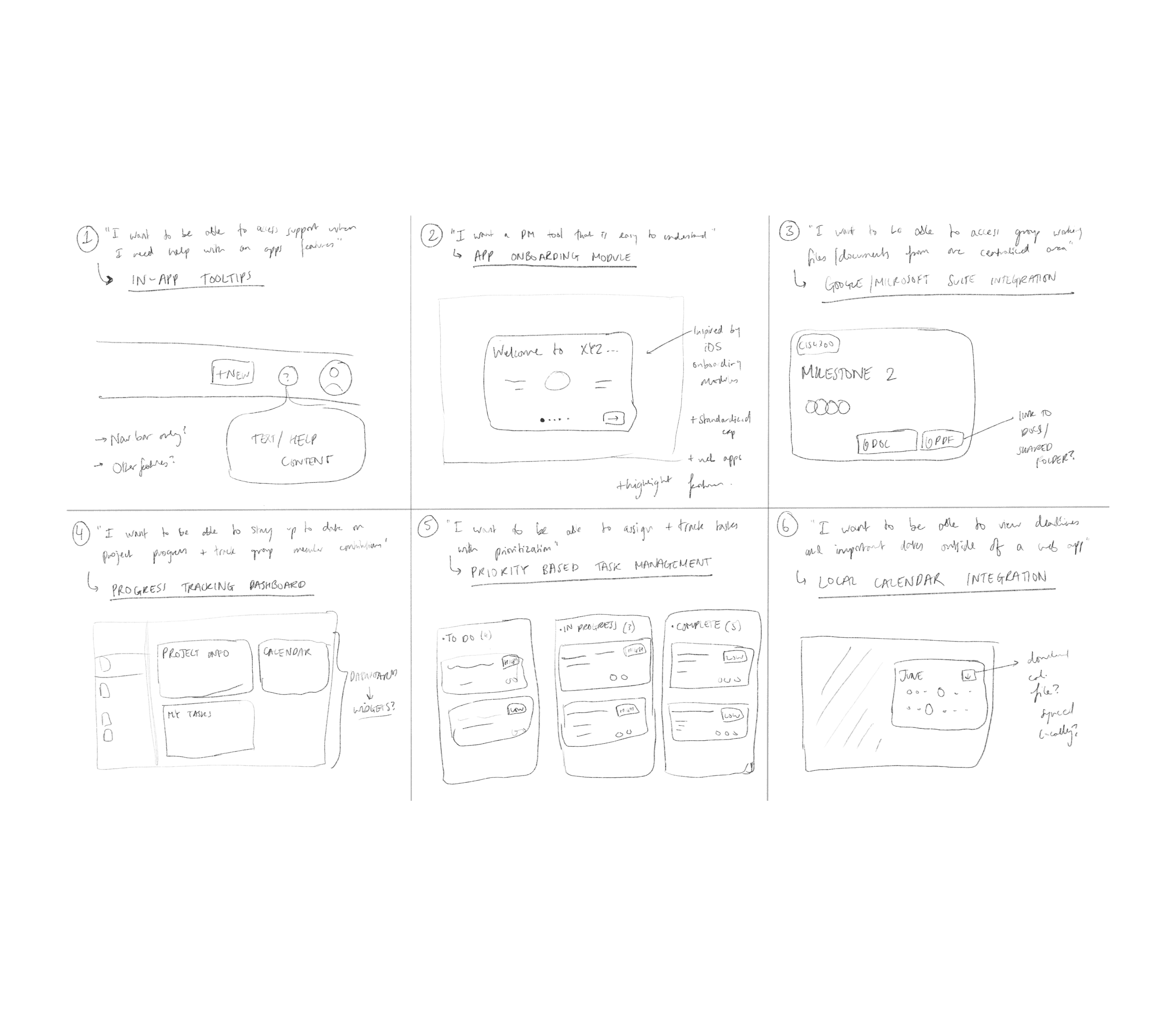
2.0
Rough sketches of potential features rom the design studio session.
2.1
Design studio output.
2
Risk-based prioritization
With a clear design to work towards, we focused on testing the most impactful yet uncertain features of our interface. We started by generating hypotheses for each specific feature, and used the hypothesis prioritization canvas to group each hypothesis into the appropriate quadrant (Figure 2.2)
Next, we identified the riskiest assumptions for each hypothesis, and chose the following most critical and uncertain hypothesis (from quadrant 1) to test via a low-fidelity MVP:
🚨
“We believe that we will achieve the business outcome of retention if a 4th year undergraduate student with intermediate technical literacy and prior experience with project management tools attains an increase in productivity and confidence in their project management ability with the help of a dashboard that provides a project overview.”
Risks/Assumptions
Features offered by the dashboard may not align with the needs of students.
Users may not be able to navigate through the dashboard's user interface.
Users may be overwhelmed by the amount of information presented.
3
Low-fidelity MVP
To create a low-fidelity prototype of a dashboard feature that could provide users with a project overview, we developed a set of questions based on the risks and assumptions of our chosen hypothesis:
Can users clearly identify and understand the features presented on the dashboard?
Do users feel overwhelmed by the amount of information presented on the dashboard, and if so, which specific elements contribute to this overload?
Can users successfully accomplish key project management tasks with the help of the dashboard interface?
Which specific features are perceived as most relevant and valuable by users, and are there any that users find unnecessary or less useful?
I then mocked up the low fidelity prototype by designing an on-screen wireframe in Figma (Figure 2.3), allowing our team to remotely test and gather user feedback in the next phase of our project.

2.2
Hypotheses grouped as per the Hypothesis Prioritization Canvas.
2.3
Low-fidelity prototype used as part of study.
1
The Usability Study
A usability study was designed to test our low-fidelity prototype, paying attention to the information we hoped to collect from users and recruiting participants who aligned with the personas we developed.
Methods such as the think-aloud protocol, observation, feature ranking, and open-ended feedback were used as part of the study.
Recruited participants shared similarities with our persona with respect to their academic level, technical proficiency, and experience with project management tool.
A total of 4 sessions were conducted virtually with users being given full access to the low-fidelity prototype while being interviewed.
2
What did we learn?
Upon completion of the study, we created an Affinity Map (Figure 3.0) to perform qualitative analysis on interview notes from each session. This helped us answer the four questions we hoped to answer through the low-fidelity prototype:
🔍
Most dashboard features were clear to users, but confusion around the calendar and project scope suggested a need for a toggle between courses for improved clarity and functionality.
🧠
Most users were comfortable with the dashboard's information load, but one felt overwhelmed by the number of features, suggesting optional customization of cards to reduce clutter.
☀️
Participants managed tasks effectively via the dashboard, valuing its clarity and oversight. Recommendations for adding detailed tasks and nested checklists confirmed its usefulness and highlighted areas for improvement.
📝
Users valued milestone tracking, calendar, and task management most; suggestions included optional calendar and customizable dashboard features to enhance overall utility.
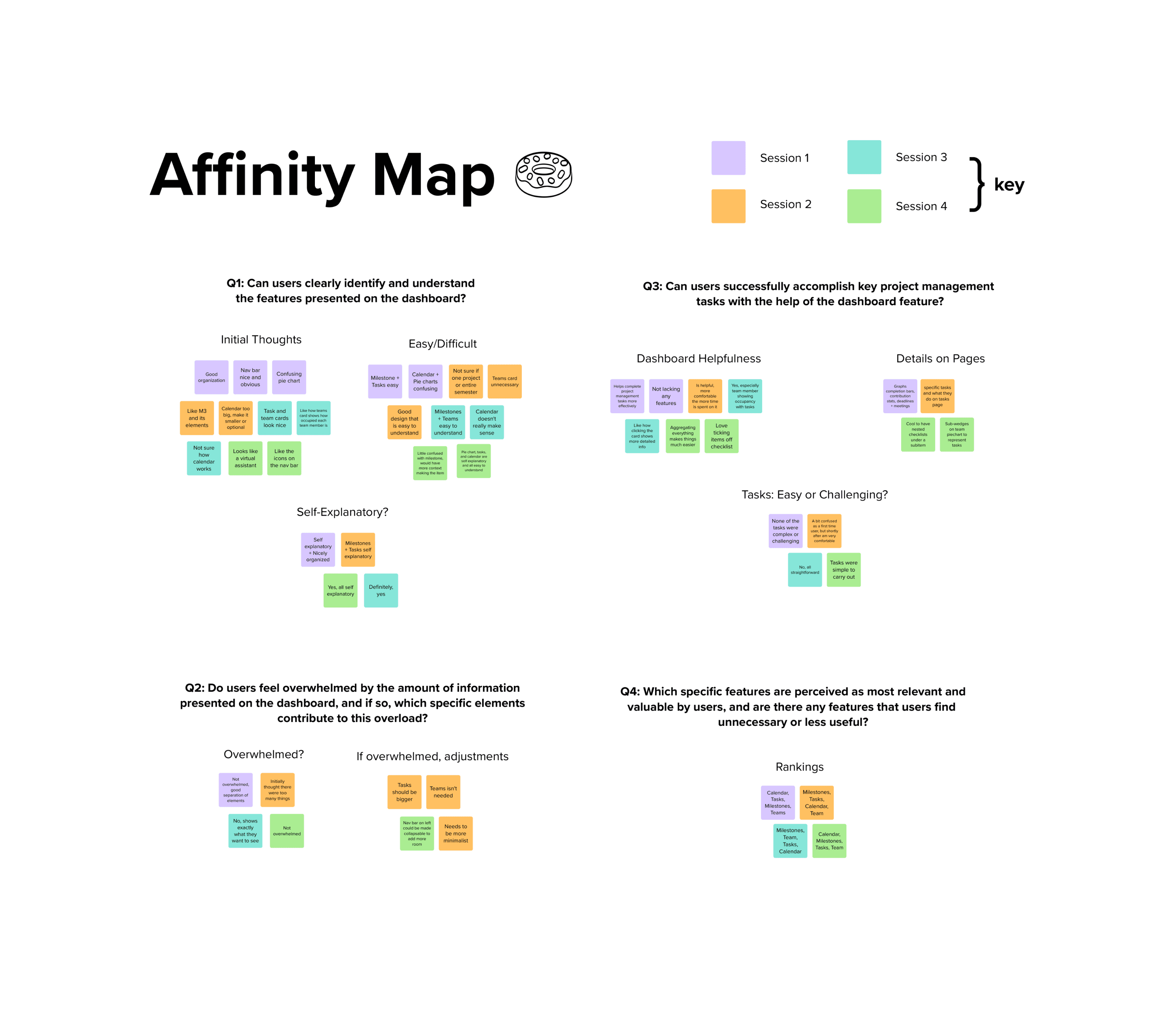
3.0
Affinity Map with groups of data collected from usability sessions.

1
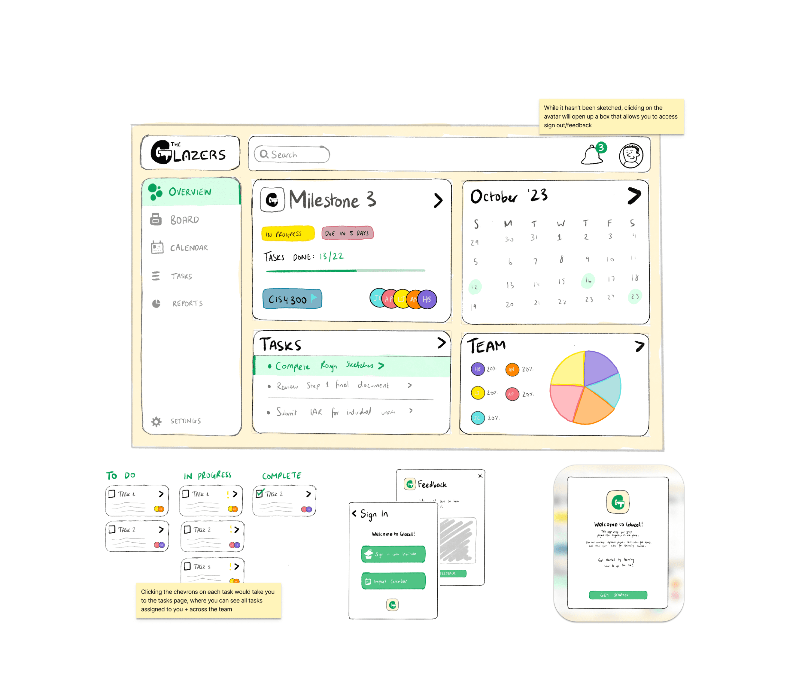
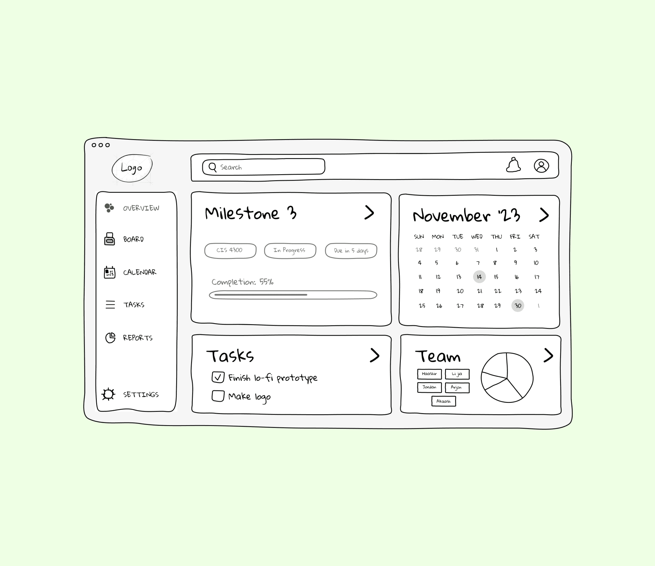
Refinements + High-Fidelity MVP
Our hypothesis was validated! Participants across different sessions expressed an increase in productivity and confidence in project management abilities when using the dashboard.
The final prototype was created with increased visual and functional fidelity in Figma. In addition to visual enhancements, it included the following additions based on the feedback gathered:
Page Title and Course Name
Added a title and course name with a dropdown feature to switch between courses. Thus ensured that dashboard elements were course-specific, improving navigation and relevance.
Collapsible Navigation Bar
Introduced a collapsible navigation bar to increase screen real estate, enabling users to add or better view the cards on the dashboard.
Edit & Add Functionality
Implemented an edit button for customizing dashboard cards by resizing, removing, or adding new ones. A large "+" appears when the navigation bar is collapsed for easy customization.
Enhanced Task Details
Revamped task cards to show detailed subtasks, current status, upcoming deadlines, and assigned team members, significantly boosting task management efficiency.
2
Takeaways
There was a lot learned over the course of this project - here were some key takeaways:
It takes a village
Successful project outcomes depend on collaborative contributions with leadership that ensures each team member's input is integrated into the final product.
Strategic application - Lean UX
Principles like hypothesis testing and rapid prototyping helped balance user and business outcomes with the need to progress efficiently.
Flexibility = Increased chance of success
Being ready to adapt or pivot based on user insights are crucial when trying to iterate effectively.

5.0
Final high-fidelity prototype for the Project Management Tool.